Protea Pulse.


Topic

UI & UX Design


Role

UI and UX Designer


Timeline

May 2024

Introduction

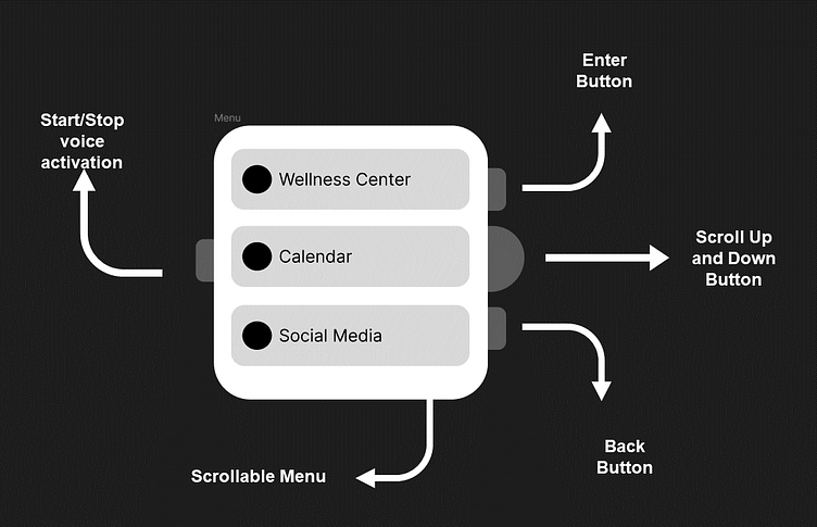
The Protea Pulse smartwatch is a design for a wearable watch designed to meet the diverse needs of several different types of users.

User Identification

Specifically, the Protea Pulse is designed to cater to three distinct types of users, each with their unique requirements and preferences :

ai generated woman, black hair in pony tail, standing in gym

Sarah 28 year old fitness enthusiast and personal trainer

I am seeking a watch interface that aligns with my active lifestyle. I prioritize health tracking features such as real-time heart rate monitoring, step counts, and calories burned. Additionally, I desire a watch that supports various workout modes with instant feedback, and it should be water-resistant to accommodate my swimming sessions. Customizable fitness goals and challenges are essential for my motivation and progression. I am excited to explore how the Protea Pulse smartwatch can meet these specific requirements and elevate my fitness journey to new heights.

ai generated woman, curly hair brown and white clothes, floral background

Emily, 22-year old fashion blogger

I need a smartwatch interface that caters to my specific needs. Having a large and easily readable display is crucial for my comfort, as I rely on quick glances to stay organized and on top of my schedule. Medication reminders and an emergency SOS feature are essential for my well-being, as they provide peace of mind and ensure I don't miss any important alerts or appointments. Simplicity in navigation and intuitive controls are paramount, as I need to be able to easily and confidently interact with the watch interface, even in hectic situations. I am eager to discover how the Protea Pulse smartwatch can meet these specific requirements and help streamline my busy professional life.

ai generated, elderly man, sitting down at table with coffee in hand

Mr Johnson 70 year old retired senior citizen

I need a smartwatch interface that caters to my specific needs. Having a large and easily readable display is crucial for my comfort. It allows me to quickly glance at important information without straining my eyes. Medication reminders and an emergency SOS feature are essential for my well-being. They provide me with peace of mind, knowing that I won't forget to take my medication and that I can quickly call for help in case of an emergency. Simplicity in navigation and intuitive controls are also important to me. I want to be able to easily navigate through the watch interface.

Specific Requirements per User

Sarah : 28 year old fitness enthusiast and personal trainer

InformationInputFeedback
Health and exercise related telemetry and statistics (heart rate monitoring, step tracking etc)SensorsVisual feedback in the form of a screen popup.
Sleep trackingSensorsVisual feedback in the form of a screen popup.
Simple navigation and interface (for when they are active and need to clearly see actions they can perform)Swiping and audioVisual feedback with the screen moving or displaying popups accordingly.
Controlling musicClicking icon or using voice controlAudio feedback with the music starting or stopping.
Smart phone pairingTapping icon for said featureVisual feedback with a screen popup.

Emily : 22 year old fashion blogger

InformationInputFeedback
Social media integrationTapping or swipingA screen popup appears.
Fashion updates sharingTapping or selecting an optionA confirmation popup or notification is displayed.
Smart phone pairingBluetooth pairing processA visual notification or vibration confirms the pairing.
Music controlTapping or using physical buttonsVisual feedback, such as on-screen controls or album art, and haptic feedback confirm the input.
Notifications and alertsPush notifications or manual interactionVisual notifications on the screen and haptic feedback alert the user.
Remote camera controlTapping or using physical buttonsVisual feedback on the smartwatch screen, such as a live viewfinder or shutter button, and haptic feedback confirm the input.
Calendar/scheduling app accessTapping or selecting an optionA screen popup displays the calendar or scheduling app interface.

Mr. Johnson: 70 year old retired senior citizen

InformationInputFeedback
Abnormal heart rate detection alertsSensorThe smartwatch provides a vibration alert for abnormal heart rate detection.
Medication remindersTapping or selecting an optionThe smartwatch sends a notification for medication reminders.
Emergency SOS featureTapping or using physical buttonsThe smartwatch triggers an emergency alert or notification.
Simple navigation & intuitive controlsTapping or using physical buttonsThe smartwatch offers smooth navigation and intuitive controls.
Customizable watch facesTapping or selecting an optionThe smartwatch allows customization of watch faces.
Health metrics (heart rate, steps)SensorThe smartwatch displays health data, including heart rate and steps.
Voice commandsAudio instructionThe smartwatch provides voice feedback for voice commands.

Similarities

Similar/Common Features:

Health and exercise related telemetry and statistics (heart rate monitoring, step tracking etc) Sleep tracking Simple navigation and interface (for when they are active and need to clearly see actions they can perform) Controlling music Notifications without checking phone Abnormal heart rate detection alerts Smart phone pairing

Different/Specific Features:

Large and easily readable display elements Medication reminders Emergency SOS feature Clear time display Adjustable brightness Vibration alerts Lightweight design Non-intrusive notifications Customizable watch faces Health metrics (heart rate, steps) Fall detection Voice commands

Additional Note - Features Needed For All Users :

InformationInputFeedback
Default screenSensor and touching screen (shake the watch in order to display default screen OR swipe from top of screen to see defaultThe smartwatch provides the screen (with back button in order to

General Design

  1. Scrollable Menu

    Limitation 1, 2, 4

    The menu consists of list items instead of a grid.

    This decision was made based on the following:

    • Three button options are easier to click on than four small grid items.
    • Icons might not be enough to inform users of the features.
    • Enhanced accessibility: A list format allows for clear presentation and easier access to specific functions.
    • Opting for a list instead of a grid also allows users to customize and reorder the items based on their preference and what they find most important. Such a feature would be difficult to implement if the buttons were in a grid instead.
  2. Scroll Up and Down Button

    Limitation 4

    Here is an image to clarify the physical structure of the scroll dial:

    scroll dial example image

    The above watch is an example of a wristwatch that has a dial. While this kind of dial could be used to scroll up and down the menu, it doesn't allow for easy access to the other buttons. This kind of dial will also require two fingers to navigate through the menu.

    Instead, the scroll up and down button will be a sideways dial like the one above that doesn't require two fingers for navigation and is much easier to grip onto.

  3. Start/Stop Voice Activation Button

    Limitation 1, 3, 4

    The button is the only one on the left side of the watch. This is done to ensure easy accessibility and distinguish it from other buttons. This means that anytime a person needs to access the button, they know exactly where it is and won’t accidentally turn any other buttons on. This is especially useful if the user may be visually impaired.

    Important Note: This is a feature that will trigger the watch to use Natural Language Processing (NLP) to understand what the user is saying and act accordingly. This is a much better alternative to using commands that the user would have to memorise. Using NLP significantly lowers the computational load the user would have needed in order to use this feature.

    Important Note: when voice activation mode is triggered the watch will send out an audible notification to confirm that users can now use their voice to control the watch

  4. Blinking Green Light

    This light switches on when voice command mode has been activated. It's next to the voice activation mode button so that users can understand that they are related. Since there will be audible confirmation of voice command mode being activated, there should also be visual confirmation so that if a user is looking at the watch they can see when voice command mode is activated. Using a blinking light instead of a use user interface components on the screen ensures that the screen isn't cluttered.

  5. Enter Button & Back Button

    Limitation 1, 3, 4

    It is expected that the primary action (submitting or entering) will occur more frequently than the secondary action (going back). For this reason, the enter button is located towards the top of the screen, while the back button is positioned accordingly.

Dionysus ↗

LET'S CONNECT